Experts have established that the colour of your room has a direct influence on your personality. The room colour can influence moods and thoughts. For this reason, it is important to carefully choose the colour that will influence the kind of thoughts and moods you want to experience everyday.
Colour affect people base on age, gender, ethnic background and climate. It is pertinent to choose the right colour because certain colours for most people tend to get similar reactions. So, to select a colour you need to equip yourself with basic information about colour and its effects.
In choosing your colour do have it in mind that each colour has psychological value. Ensure to think about how certain colours make you feel, from tranquility to rage. So, choose your colour wisely.
When you want to choose the colour of paint for your room ask yourself the following questions: what mood do I want to create and which colour will help me achieve that mood? You can get answers to the questions by checking blogs, websites, decoration books, among others.
Colours act in three basic ways: active, passive and neutral. You can deliberately match the room colours to your personal desires, to your taste and to the room's purpose.
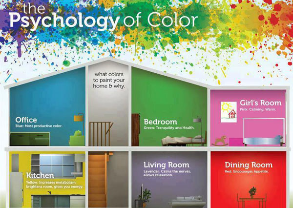
RED raises the room energy level. The most intense colour, it pumps the adrelanine like no othe hue. It is a good choice when you want to stir up excitement, particularly at night. Red draws people together and stimulate conversation in the living room or dinning room. In an eatery, it creates a strong first impression. Red has been shown to raise blood pressure, speed respiration and heart rate. It is usually considered too stimulating for bedroom.
YELLOW captures the joy of sunshine and communicates happiness. It is an excellence choice for kitchens, dinning rooms and bathrooms, where it is energizing and uplifting. In halls, entries and small places, yellow can feel expansive and welcoming. Even though yellow although is a cheery color, it is not a good choice for main color schemes. Studies show that people are more likely to lose their temper in a yellow interior. Babies also seem to cry more in yellow rooms. In large amounts, this color tends to create feelings of frustration and anger. In chromotherapy, yellow is believed to stimulate the nerves and purify the body.
BLUE is said to bring down blood pressure and slow respiration and heart rate. That is why it is considered calming, relaxing and serene, and it is often recommended for bedrooms and bathrooms. A pastel blue that looks pretty on the paint chip can come across as unpleasantly chilly on the walls and furnishings, however, especially in a room that receives little natural light. If you opt for a light blue as the primary color in a room, balance it with warm hues for the furnishings and fabrics. To encourage relaxation in social areas such as family rooms, living rooms or large kitchens, consider warmer blues, such as periwinkle, or bright blues, such as cerulean or turquoise. Blue is known to have a calming effect when used as the main color of a room — but go for softer shades. Dark blue has the opposite effect, evoking feelings of sadness. Refrain from using darker blues in your main color scheme.
GREEN is considered the most restful color for the eye. Combining the refreshing quality of blue and the cheerfulness of yellow, green is suited for almost any room on the house. In the kitchen, green cools things down; in a family room or living room, it encourages unwinding but has enough warmth to promote comfort and togetherness. Green also has a calming effect when used as a main color for decorating. It is believed to relieve stress by helping people relax. It is also believed to help with fertility, making it a great choice for the bedroom. Purple, in its darkest values (eggplant, for example), is rich, dramatic and sophisticated. It is associated with luxury and creativity; as an accent or secondary color, it gives a scheme depth. Lighter versions of purple, such as lavender and lilac, bring the same restful quality to bedrooms as blue does, but without the risk of feeling chilly.
ORANGE evokes excitement and enthusiasm, and is an energetic color. While not a good idea for a living room or for bedrooms, this color is great for an exercise room; it will bring out all the emotions that you need released during your fitness routine. In ancient cultures, orange was believed to heal the lungs and increase energy levels.
NEUTRAL (black, gray, white and brown) are basic to the decorator’s tool kit. All-neutral schemes fall in and out of fashion, but their virtue lies in their flexibility: Add color to liven things up; subtract it to calm things down.
BLACK is best used in small doses as an accent. Indeed, some experts maintain that every room needs a touch of black to ground the color scheme and give it depth. To make the job easier, rely on the interior designer’s most important color tool: the colour wheel.
COLOUR'S EFFECTS ON CEILING
The ceiling represents one-sixth of the space in a room, but too often it gets nothing more than a coat of white paint. In fact, for decades, white was considered not only the safest but also the best choice for ceilings.
As a general rule, ceilings that are lighter than the walls feel higher, while those that are darker feel lower. Lower need not mean claustrophobic: visually lowered ceilings can evoke cozy intimacy. As a general rule, dark walls make a room seem smaller, and light walls make a room seem larger.
These guidelines are a good starting point in your search for a paint color. Keep in mind that color choice is a very personal matter; you are the one who has to live with your new paint color, so choose a hue that suits you, your family and your lifestyle. If you have any tips to share, please leave a comment below!
Source:
Here.